Charts are trellised when multiple measures are added to the primary axis in the Values drop zone. By default, when charts are trellised vertically, one visual is displayed in each row (see image below). When charts are trellised horizontally, several visuals are displayed in each row.
Native scrolling enables you to scroll through the trellised charts. You can also adjust the trellis settings from the Trellis drop-down and Trellis dialog.
Access the Trellis Drop-Down
Open the Trellis drop-down from the Component ribbon to access custom trellising options. Toggle the button to enable "standard" (default) trellising (see below), or open the drop-down to access additional settings.

Standard
Click "Standard" to revert to the default trellis layout if you've made changes to the number of visuals per row.
Custom
Under Custom, select the number or visuals to display per row, up to a maximum of 4.
Trellis Dialog
Click "More" to open the Trellis dialog, where the visualization height can be adjusted.
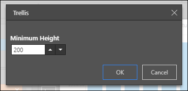
Minimum Height
- when a standard trellis is selected (that is, one chart per row) the minimum height determines the height of each chart.
- scale to fit overrides minimum height.
- default is 200.
- maximum is 400 and minimum is 100.
- depends on screen resolution
Examples
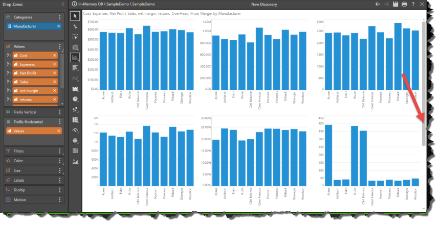
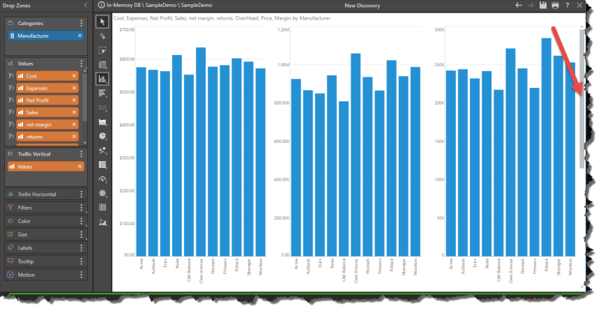
In this example, 9 values were trellised vertically, and the custom trellis set to 3 visualizations per row (green highlight below).

Next, the minimum height was changed from 200 to 400, so that only one row is displayed on the canvas. A scroll bar (red arrow) enables the user to scroll down to the next rows.
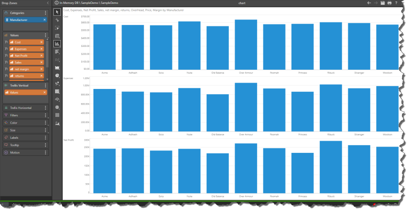
Next, the values were trellised horizontally and the minimum height reduced from 400 to 300, so that 2 rows fit on the canvas.